“Is Instagram to blame for why coffee shops everywhere look the same?” — Quartz, 2019, 5:02 — https://www.youtube.com/watch?v=blb-nVfOFwM
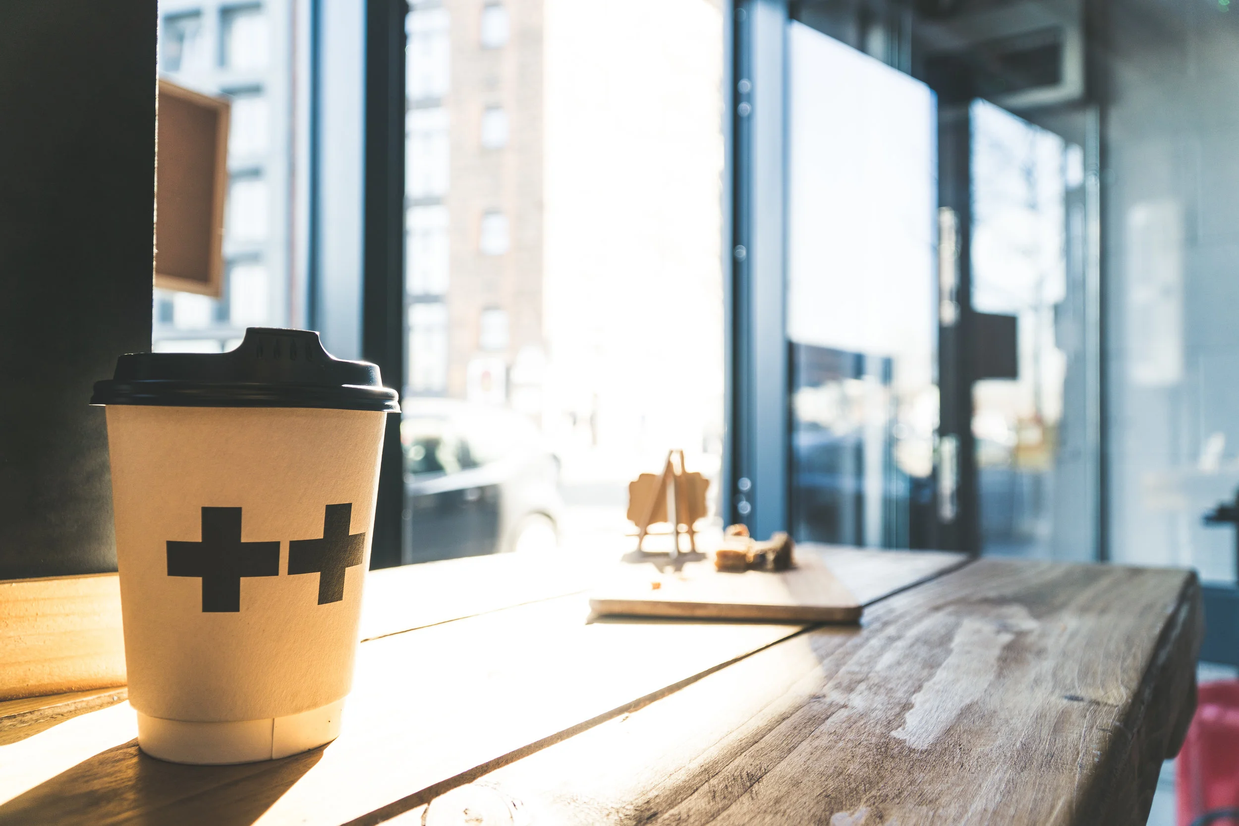
Why do many coffee shops look and feel the same? This short video argues the “Brooklyn style” of cafes has become the new design default all over the world. Social media has played a large role in this transformation— The ‘Instagramability” of a setting is now a powerful marketing force for new customers as well as regulars who wish to be associated with hip places. We also learn about the new trend of “luxury minimalism” where stripped-down atmospheres are the new hot style. This video can be used to spark discussions of culture, social media, and consumption. It may also be enlightening to apply George Ritzer’s concept of McDonaldization. Has social media created a uniform aesthetic for coffee shops and other businesses? Where else do you notice this trend of uniformity?
From the video’s description: In coffee shops all over the world, the same set of design elements keep popping up. What is happening? This week, Quartz News looks at the global look that's part Starbucks, part Silicon Valley, and very "Brooklyn." If you’re in cities like Mumbai, São Paulo, Seoul, Paris, London, Kuala Lumpur, Lagos—anywhere, really—you might notice something: coffee shops are starting to look the same. Distinctive design elements—Edison bulbs, reclaimed wood, potted plants, exposed brick—are popping up in coffee shops everywhere. It isn’t just the design of these spaces that are becoming increasingly uniform. The expectation of enjoying beautiful, artfully-decorated, high-quality coffee has spread to places as far-flung as Auckland, New Zealand, and Atyrau, Kazakhstan. (To understand this, just follow #latteart on Instagram). While it’s debatable where this look originated, it has come to be associated with one place: Brooklyn, New York.

